 Pelican Design System
Single Pane
Pelican Design System
Single Pane
Single Pane
A image next to a solid block of color with text and a link.
On this page:
Best Practice
- The large text should be succinct.
- The smaller text can be longer, but try to keep it brief. Lengthy text will defeat the purpose of a Hero Block.
- Don’t use more than the number of buttons shown in this Hero Block.
- Do not use a random or decorative image.
- Be sure to change the heading level as appropriate.
Usage
Big text.
This is smaller text which explains this block. This is smaller text which explains this block.
Button Text<div class="hero-single-pane hero-solo-pane">
<div class="row mx-0">
<div class="col-lg-6 half-left" style="background-image: url('/img/photos/pexels-photo-275030.jpeg');">
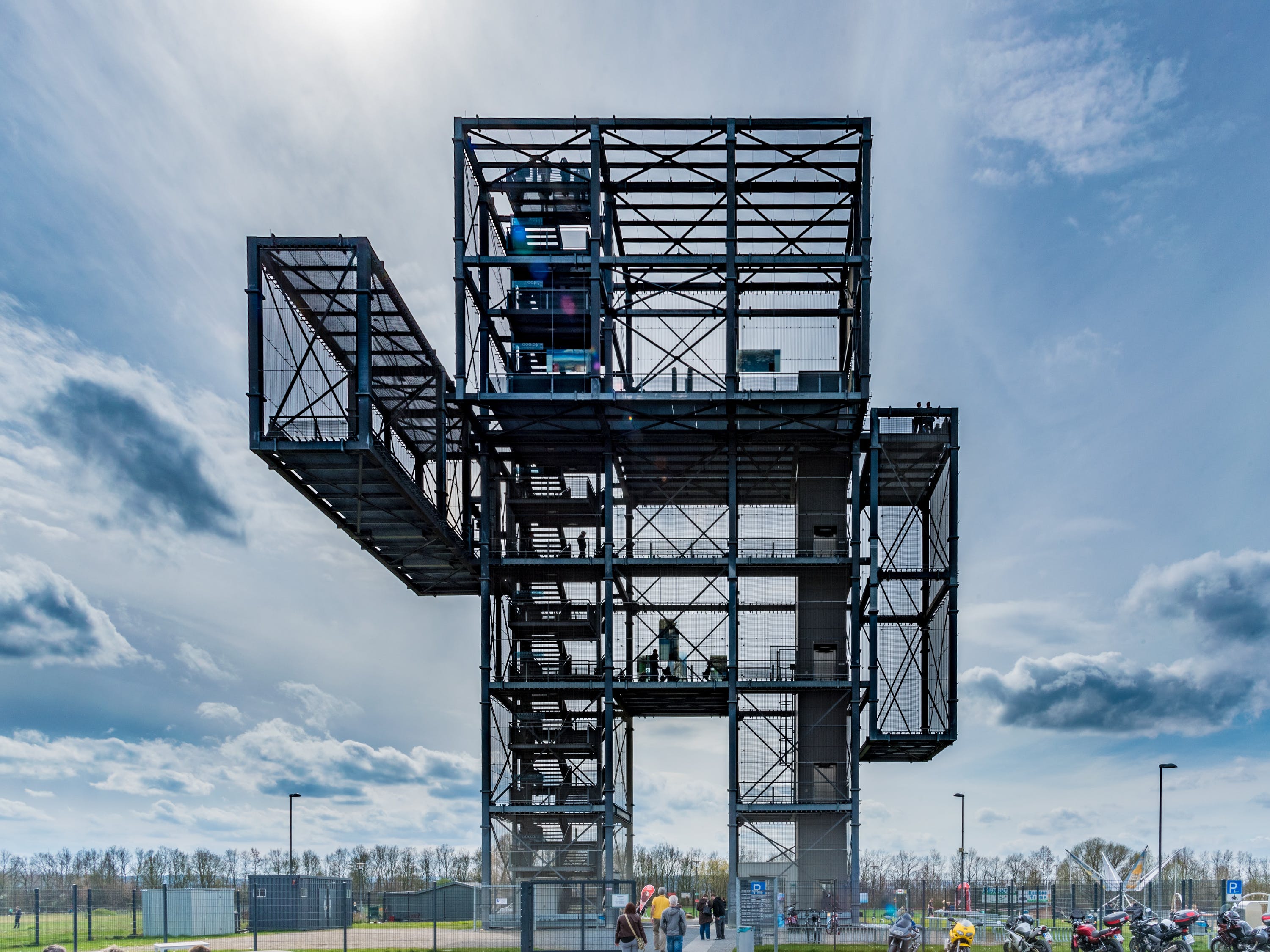
<img src="/img/photos/pexels-photo-275030.jpeg" alt="Photo a building shaped like a person." class="img-fluid">
</div>
<div class="col-lg-6 half-right">
<div class="container-fluid">
<div class="row">
<div class="col-10 col-lg-8">
<h1 class="hero-big-text">Big text.</h1>
<p class="hero-small-text">This is smaller text which explains this block. This is smaller text which explains this block.</p>
<a href="/introduction" class="btn btn-white btn-lg">Button Text</a>
</div>
</div>
</div>
</div>
</div>
</div>